Feature highlights - or what's changed compared to standard OPC:
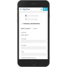
- No redundant clicks required - no buttons for choosing checkout type, no "Save" button, it's true One click checkout
- Designed with customer visual comfort in mind - compact, not too much cluttered, no surprises, just simple understandable form
- Inline validation - as per study (http://www.alistapart.com/articles/inline-validation-in-web-forms/), inline validation definitely helps to increase customer satisfaction and thus buying potential
- Better error reporting - error messages are more unified in look and are displayed closer to problematic area and thus help customers to locate more easily what's wrong
- Payment methods are displayed right away and in stylable fashion as radio buttons, no waiting for address fill-in and ToS confirmation
- As with previous versions, very popular Sticky cart and/or Sticky summary, i.e. cart block or cart summary sections is always visible, it's floating.
- Info block (also sticky!) ...everybody likes it, see for yourself on demo site
- Page fading, for better focus on checkout while being on checkout form (fades out disturbing elements on checkout form)
- Multiple addresses support, seamlessly integrated as in previous version
- Finally, support for virtual goods! No delivery address, just email and payments.
- Extensive configuration possibilities back office
- Automatically localized to your language - reusing default translations + many translations contributed by our existing customers worldwide
- Checkout form compliant with the new German e-shop law!
- Integrated ship2pay module (restriction of payment modules based on carrier selected, payment modules are ajax-refreshed immediately)
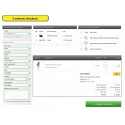
- 3 layout options available - single column, two columns and three columns for even more compact look
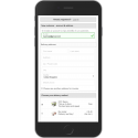
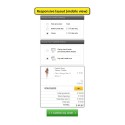
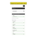
- Fully Responsive with all responsive templates for PS 1.5 and 1.6


